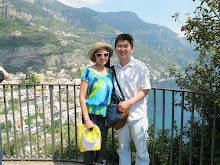
 "Dining with a View, " this title really said it all! It was our second day in Moorea and decided to hung out at the hotel property. We had a breakfast & dinner meal plan with the hotel. Since we went to the Tiki Village Theatre the night before, we asked the front desk if we could exchange one dinner for a lunch instead. They agreed. Well, that's how we ended up dining at the hotel's bar, overlooking the view with a glass of delicious pina colada and our 3 course meal.
In this layout, I decided to use two different color cardstock.
 I hated the small fonts so much, I ended up cutting huge huge fonts to make sure I could use the runner tape easily!
For the left side of the layout, I decided to use pattern paper to cut the fonts and flourish out. It added color to the page. I love the color of the pattern paper!
 The right side of the layout was a bit weak, to be honest. The page looked very plain, even with 3 strips of pattern paper running down the layout. There's something about the layout that didn't seem to go together. Till today, I find this page to be my least favorite!
 I wrote a small journal along with the foods that we ordered on the right side of the layout. For a lunch, that was a really big lunch! On the left side, I wrote out the name of the restaurant we ate at and the date we dined. I used pattern paper behind both tags to add more colors.
If I were to go back and redo this layout, I would complete redo the entire layout! I would totally add a photo mats behind the 2 pictures on the left side. I probably would use green or blue cardstock for the photo mats. For the right side, I probably would redo the entire page. I would change it to the beige cardstock to match the one on the left side. I would probably keep the theme of blue and green to keep the page more "uniformed" looking. I probably would make the pictures turn a bit to give the page more of a "fun" look.
What I love about this page, I loved the pattern paper that I used to cut the letters and the flourish out! The two tone colors added a pop to the page.
Next time, another layout of the food we ate at another restaurant at the resort.


No comments:
Post a Comment