Thursday, March 31, 2011

Ojai, CA


Ojai, a small little town in Ventura County, won my heart. I cannot forget how nice and peaceful the place was. I keep wanting to return for a longer stay on the weekend to spend more time in town. Ojai is known for the "Pink Moment." I tried to capture the moment on camera, but didn't seem to do too well.

I chose to use orange as a background and used pink and green pattern papers to put this single layout together. I kept the layout simple by alternating the pattern papers. This was my first scrapbook page that I used my Silhouette Cutter. I decided to do something simple, and cut letters with it. I also decided to overlap part of the pictures.


I decided to print out a google map to show the hotel we stayed, the restaurant we dined at to add a little extra touch to my layout. This way, I would never forget where I went when I visited Ojai back in 2008.

I liked the color of the page. I totally loved the cutter as I didn't have to spend hours to cut each letter out by hand! If I were to redo this page, I would give this page a new title, other than calling it as, "Ojai, CA."

Looks like this is my last entry for the month of March. Hopefully, I will continue to post just as much in April. I am doing my best to balance my time of posting and scrapbooking.

Wednesday, March 30, 2011

San Francisco

Last time I went to San Francisco, I was probably 10 years old. Time surely flew by quickly! Nevertheless, it brought back some good memories, and created some new memories with Tommy. There were places in San Francisco that I had never been to, and was able to visit the second time.

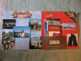
The double layout didn't take too long to put together, but I surely had a difficult time putting it together because I didn't know what I wanted to do, and how I wanted to put the page together. There were quite a bit of pictures that I wanted to use, but didn't know how to incorporate it in a double layout. I believe this was my first time to use many different pictures for a layout and my first time to create a pocket.

I bought the Jolee's Boutique Title Wave of San Francisco and decided to use it as a title for my page. I used a blue pattern as background. During the time I was putting this page together, I still had not really figured out how to mix and match different papers. I used 5 different pictures for this layout. I should cut all the pictures to the same size to keep it uniformed.

Besides the title wave sticker, I also used Jolee's Boutique Themed Destination Stickers of San Francisco to add embellishments to my page.

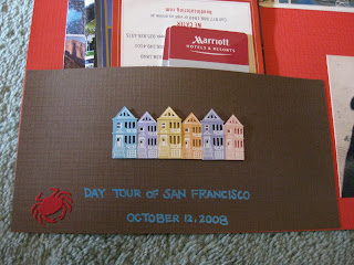
A pocket for the collection of brochures & memorabilia picked up in San Francisco!

The hardest part of this page was creating the pocket. I thought the pocket was simple to put together. I thought I only needed to tape down 3 sides, and leave a little space, and I created a pocket! I didn't take into account of putting a bunch of brochures which the sides kept detaching on its own.

I really liked the title wave and the pocket. Of the two pages, I enjoyed the left side. If I could redo my layout, I would definitely fix the pocket so it would not detach on its own. I would completely redo the entire layout on the right side! It felt too empty to me.

Next time, a post for the single layout that I used my Silhouette digital cutter for the first time.

Friday, March 25, 2011

Napa Valley

My first weekend trip with Tommy, and we decided to take a road trip up to San Francisco and Napa Valley. We took my dad's BMW (which I paid lease on, and besides, his car was way under mileage! Totally took advantage of it.) We drove to San Francisco on Friday night and didn't arrive there until past midnight. We woke up early on Saturday morning to head to Napa Valley for our wine tasting adventure for the day. I am not going to be blogging about my wine tasting adventure in this blog. I will eventually blog about it in my travel blog, if I ever get to it.

We picked out 4 wineries we wanted to visit, but during our adventure, we took some advices from local wineries to visit some "must-visit" places. We ended up with 5 wineries for wine tastings, 1 winery for lunch, 1 winery for picture perfect view (winery closed by the time we got there!) and 1 winery that we couldn't tour because their tour was fully booked. We visited a total of 8 wineries!


I decided to do a double layout to showcase the wineries we went to. I decided to use a orange background because we went to Napa in October. Orange color reminds me of Fall season. I drew dotted lines on the layout to represent how we toured Napa Valley. I used a journal tag to list out the wineries we went to by order. I used Jolee's dimensional stickers as my embellishments for my layout.

What I like about this layout is the color. Everything seemed to match really well. I really like how I position each picture. It gave a playful, uplifting feel to the layout. I tried to do some stamping and embossing, unfortunately, it failed because I didn't have the right tool at that moment to emboss. I eventually gave up on the idea of stamping and embossing on this layout. Nonetheless, this page became one of my favorite.

Have a great weekend! :)

Tuesday, March 22, 2011

Happy Birthday Tommy!

This was my first layout created as a gift. It took many hours to complete this page. I had to cut everything out by hand. Every year, when I present the wrapped gift to Tommy, before he even unwrap his present, he knew exactly what I got for him. Well, he couldn't figure out what I had gotten for him that year. I caught him by surprise.

The title was very generic, "Happy Birthday Tommy!" I just didn't know exactly what to put as a title. The layout would look kind of empty if I didn't add a title to it. I took most of the time cutting out all the letters by hand. I had to do them twice. I had to print the letters in black and I also printed the letters on a blue cardstock paper. I probably took more than 6 hours cutting out the letters. I also added glitters to the blue letters as well to add a bit of sparkle.

Oops, how did I turn my page sideway to take this picture?

The second hardest part of this layout was the cutting of the swirl. I printed different swirl sizes to see which one would look the best before cutting it out. I printed the swirl on a white cardstock and used scribble paint to trace over the swirl. I added white glitters to the wet paint. When the paint dried up, the design would add a little bit of dimension, as well as some sparkle to the page. After the paint was fully dry, I used a knife to cut the swirl out. I had to be extra careful when I was cutting the swirl out. The most difficult part was cutting out the inside of the leaves.

I decided to do something different and created a double frame to the layout. Since it was my first time doing it, I had to create the frames several times to perfect what I wanted to look like. Because the frame was the focus of the page, I spent some time to do the measurement.

I added a small personal note to the page. It was like a birthday card/ scrapbook page/ birthday gift mixed into one.

Finished product, along with the frame

If I could fix the layout, I would move the letters lower because the letters were too close to the top of the frame. I didn't take the frame into account when I was putting this page together. The letters seemed to be positioned well without the frame. Once the frame was added, the top had been cut off.

With such hardwork, it surely paid off for my Christmas gift that year. Tommy had gotten me one of the most thoughtful gift I could ever imagine, the Silhouette Digital Cutter! :) Yay to no more cutting letters and delicate things with a pair of scissor! Yay to time saving! Yay to create more pages!

Tuesday, March 15, 2011

"Plant Your Love & Let It Grow"


Excuse my bad picture taking skill. I think my flash broke. I waited for few months before replacing my old point and shoot (Casio Exilim) with a new pink point and shoot (Canon SD1100 IS) camera back in 2008 because I had a difficult time deciding if I wanted a pink camera for myself! These pictures are the last pictures off from the old camera.

This picture was taken at my cousin's baby red egg & ginger 1- month party. My cousin and I were playing around with the different camera functions. We turned the picture into black & white. The picture was cute and couldn't pass up to create a layout for Tommy and me.

I was actually trying to find an excuse to use the new glitter flowers brad, by Heidi Grace Design, I bought at Joann's. I believe that was the first set of flowers and brads purchased. I still have some flowers and brads that I haven't use.


I kept this page extremely simple. I decided to use green background because the quote was printed in green and brown. I chose to use different shades of green and brown to create this layout. I used 3d foams under the quote to create a dimension on the layout as well.

I was still unable to cut the border straight with the edge scissor. One side was bigger than the other side! One day, I will perfect the scissor cutting skill! With such a simple layout, it took me awhile to complete because I sat at my desk and spent hours to think how to put the page together!

What I really like about this page was the frames I created in the middle of the page. It created a focus for the layout.

Next time, my first scrapbook layout as a gift, and it was for Tommy. :)

Monday, March 14, 2011

What Will Happen to Pookie?

I decided to create a mini album within the layout. It was my first time putting something like this together. It was much more difficult than I thought because I didn't know how much space I needed to put the brads on the side to flip like a book. I didn't know how to align the brads. Look closely, and you can see that first 3 brads are spaced out closer than the 4th brad. It was a big challenge on its own. Nonetheless, it was a fun layout to do.

I decided to use foam letters to put the title together. I was tired from cutting letters with my own hand. I decided to use chalk and stencil to color in the paw. On top of each paw, I used a white pen to write out "Pookie."

From time to time, Tommy would pass out on my coach while watching TV. I normally get bored from watching TV by myself (maybe that's why I stopped watching TV nowadays) and his snoring sometimes overpower the volume of my TV, I would find ways to wake him up. I love to pick on my dog once in a while while he was sleeping. I decided to pick him up and dropped him on top of Tommy to see what those two would do. The result? Well, let's just say I was glad that I had my camera with me at that time to capture a really funny moment!


I did a mini album to chronograph the interaction of the two. I also wrote a small journal for each of the picture. I decided to use the same color of the album with the background to keep the page from looking too busy. The pictures were 4x6, I had to create the photo mats which I had never done before. It was difficult because I didn't know how big the mats needed to be. Aside from that, I had to leave extra space on the side to put the brads in. The last picture was taped down onto the layout.

I used a small single hole puncher to punch out the hole as the brad was quite tiny. The entire brad would go right through if I used a regular size hole puncher. I believed the hole was a bit small for the brad to pass through, so I punched another hole right next to the original one to make the hole bigger. Unfortunately, this was where I messed up. I didn't use a ruler to plan out where to punch a hole. By the time the paper were pierced, it was too late to fix the mistake. Always use a ruler to measure everything!

If I were to do a similar page in the future, I would need to align the brads evenly with a ruler. I will have to make sure that I don't poke the brads through the background page as well. I would need to score the edges to keep the edges nice and sharp to have the clean folded edges like the birthday cards bought from the store.

Until next time... Have fun scrapping! :)

Wednesday, March 9, 2011

Chilling on Water


My Pomeranian, Pookie, has a girly face and sometimes, I wondered what is on his doggie mind. He seems to know how to get you to give in to him. Well, at least his cute look gets my parents to give into him almost 99% of the time. My parents treat him like a baby. He is also not a very brave dog.

I took Pookie over to Tommy's house one summer afternoon. Tommy decided to test Pookie to see how brave he was. He put him on a board in the swimming pool to see what he would do. If he had short fur, we probably would try to test his swimming skill. Unfortunately, we didn't want to punish ourselves to comb his fur if his fur would had been tangled while in the water. I think he was nervous, yet probably enjoyed his way around the pool.

What I liked about this layout is the 3 small pictures on the left hand side. It was the different angle of Pookie while he was in the pool. I have yet to get a hang of using the edge scissors. If you look closely, you can see that the wave was not cut evenly!

I decided to print the title on the cardstock for this layout. I found a cute font and went with it. I added a few rhinestones on the title to make the page not so simple and boring.This was my first layout that I incorporated a journal to my scrapbook.

If I were to redo this page, I would want to layer a few pattern papers over the beige cardstock. I would use a corner round punch to round the corners of the pictures. Nonetheless, this layout still looked great.

Next time, another layout about Pookie. I took my layout to a whole new level.

Monday, March 7, 2011

Turning 67


This was my first double layout. I had absolutely no idea what I was doing when I was putting this layout together.

I decided to do a double layout for my dad's birthday as he turned 67 couple years ago. This year, he will be turning 70! Oh my, how time flies! It is not until I looked back at this page until I realized that he is going to be 70 this year. I am blessed to have him supporting me all the time. I am truly blessed that he has good health, and really, he just doesn't look that old to me.

This layout was rather simple as I was still trying to figure how to put different pattern papers together to look great. I ended up cutting strips pattern paper to create a border instead since I was pretty confused at that time.


The letters were hand cut by a pair of scissor. It wasn't as difficult to cut because the letters were much bigger, and much easier to cut. However, I had to cut double as I used 2 different cardstocks for the letters. The yellow letters were slightly raised. I used 3d foams to make them raised.

I used ink stamp to stamp the date of the event. It was a pack of wooden stamps with individual alphabet on each end. It was my first rubber stamp I owned. The most difficult part of stamping was aligning all the letters. I had a tendency to shift things upward or downward. In order to keep it straight, I had to use pencil and ruler. Once the stamp part was done, I had to go back and erase the line.

This layout is probably the most simplest double layout I had ever created. It's not my most favorite page, but when I look at it again, I grew to like this page in a strange way.

Thursday, March 3, 2011

Summer Nite

After my "A Day at Huntington Library" layout, I was so excited of how it turned out, I decided to dig through printed pictures at home to work on my next layout. I found pictures back from 2005. Tommy and I were invited by a friend to hang out at Lacy Park in San Marino for the Fourth of July celebration. It was a nice evening to hang out under the star with great friends.

To keep with the Fourth of July theme, I decided to stick with red, white and blue color. All the letters were printed from the printer and hand out with a pair of scissor. I could not remember how many hours I worked on cutting the letters, but I remembered the pain on my lower back. It was painful.


The bigger the letters, the easier it was to cut. However, the smaller letters, "San Marino, CA" and "July 2005," it took a long time to cut! I didn't do a great job in cutting because there were white spaces which I was unable to cut.

The embellishments were from Jolee's Boutique. This was a very simple page design with minimal use of embellishments and color cardstocks. With this simple page design, I think it took me many hours to put together. It was partially due to cutting the letters, but I had a difficult time trying to incorporate all the paper together onto a layout.

If I were to redo this page, I would totally round the corners of the pictures.

Next time, my first double layout.