Showing posts with label white. Show all posts

Monday, July 18, 2011

Goodbye Moorea...

Goodbye Moorea, and goodbye flash on the camera! After few different shots of us sitting on that coach, the gorilla pod lost its balance and grip on the opposite chair that the gorilla pod was gripping, the camera fell backward dropped onto the marble floor. The flash broke instantly. :(

I kept the page simple. I asked Tommy to participate in this layout as well. I decided to use a beige color cardstock as my background.

I decided to use 1 photo only for my layout. Because the hotel lobby was very opened, bright and green, I decided to stick with a theme in this layout with similar color to the picture. I found a pattern green & white paper. I decided to use it to cut the font from my Silhouette Digital Cutter. After cutting it out and removing the letters from the carrier sheet, I noticed that the fonts was too light if I decided to adhere them onto the cardstock. I decided to cut another set of the letters with brown cardstock to make the other pattern stand out on the page.

I decided to create use my digital cutter to cut out the photo corners. I used a different green pattern paper to cut out the corners. To keep it uniformed, I also cut out another set of photo corners to put behind the pattern paper.

I adhered the picture over the photo corner.


I asked Tommy to write about his Moorea experience. He kept his journal short, partially because he forgot most about his trip, other than how excited he was, looking forward to Bora Bora that day!


As for me, I also wrote a journal. I managed to squeeze so much in with so little space provided for myself. I retained a lot of detailed information in my mind (I called them... unnecessary information!) I usually write small, but I think I wrote even smaller in this.

I decided to cut 2 pieces of green cardstock to adhere behind the 2 journals. I had some small blue flowers and decided to use them. I added rhinestones the flowers to give a little bling to my page.

That's it for Moorea! Follow my travel blog on my travel experience!

Saturday, June 25, 2011

Beautiful Sunset

What I missed the most in Moorea was the time where Tommy and I could hang out and watch the sunset. I love watching the beautiful sunset by the lookout. It had an unobstructed view.

I decided to use a orange cardstock as background. Do you recall my Le Matiehani page? I used the same glitter pattern paper for this project. I bought extra at the scrapbook store in case I mess up, I still have an extra cardstock for me to work on. I managed to not make a mistake on my other layout. I was able to save the extra cardstock for another project. This layout was totally calling for it.


Instead of wasting such beautiful paper, I cut out four strips of 1x12. I used runner tape and adhered to each side of the orange cardstock.

I used my digital cutter to cut out 4 photo corners. Instead of using all 4 for one picture, I decided to use 2 corners for each of the picture for the project. I looked through my quote stack to see if there was anything I could use. I found "What a view..." in the stack. It was perfect! The color matched with the project coincidentally. I created a frame for the vellum quote as the vellum was orange. If I were to stick it over the orange cardstock, the quote would not stand out.

I also found a matching flower in my flower collection and decided to use it. It seem to go well together.


I also used my digital cutter to cut out the font. I used the Xyron X to create the sticker for the letters so I could easily adhere the letters onto the page. For the 4 photo corners, I also ran them into the Xyron X, 2 times. The first time I ran them through, I added fine white glitters on them. After dusting all the excess, I ran it through to get the other side sticky to adhere to the cardstock.

I like this page alot. It looks very simple, but pretty at the same time. I loved how I made use of the glitters on the photo corners. It gave a little bit of a sparkle, like how the water sparkled when the sun is hitting the water.

Monday, June 20, 2011

Pool

I love the pool at the resort. If the sky is the limit, and money is not an issue, I totally love to have a similar version in my own backyard! For now, I will continue to dream about my dream house and pool.

With the underwater case, we were able to take some cool videos and pictures in the water. I used some underwater pictures for some of my scrapbook pages. Stay tune for my blog! I am also writing in my travel blog, about my travel experiences, things that caught my eyes on the trip.


For this single layout, I used a light blue cardstock as my background. I used a blue ink chalk to chalk all four sides of the cardstock. I picked 2 pattern papers to compliment the colors for my layout. I kept it simple. I also used ink chalk to chalk all sides of each strip.

I overlapped part of the 2 strips of pattern papers. I resized and arranged all the pictures. I added 2 flowers and secured with a brad.


I used my digital cutter and cut out a corner flourish and the letters. I adhered the corner flourish with the runner tape. I used the Xyron X to create the sticker for the letters.

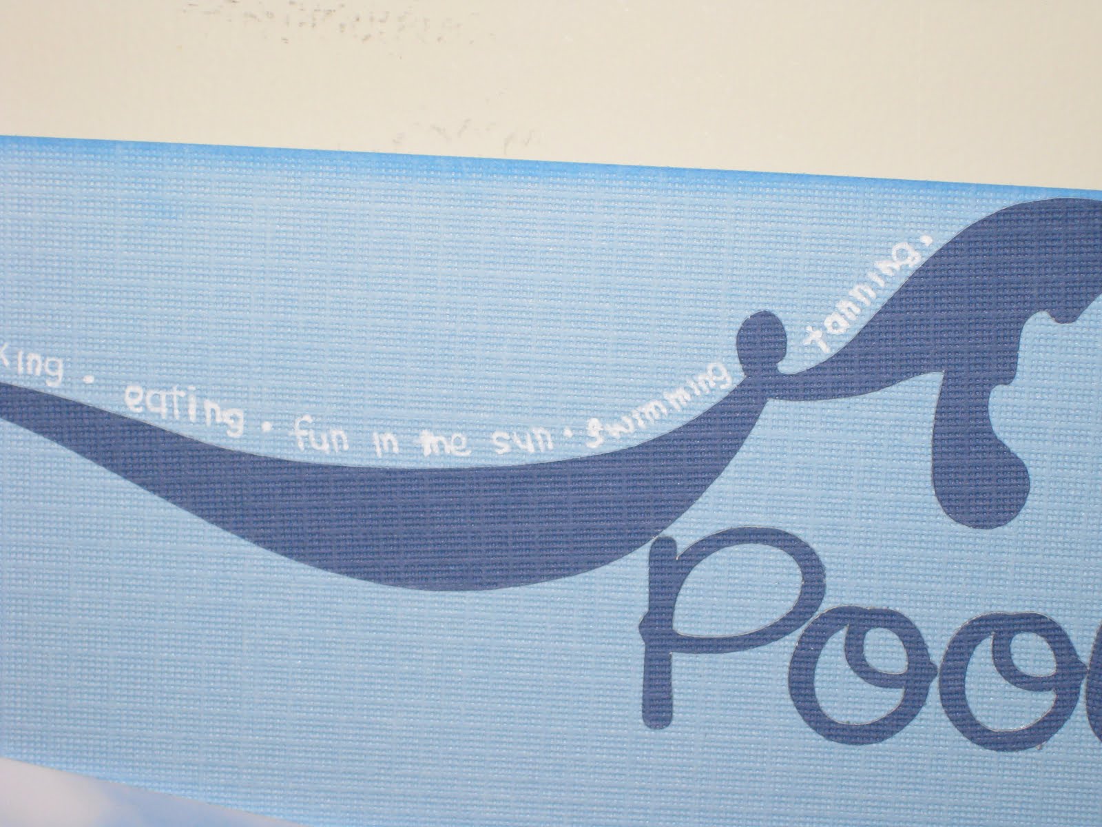
I used a white pen and wrote out the different types of activities we did by the pool side. Instead of writing a journal, I decided to use short phrases, single word adjectives and verbs instead. I had no other place to write them, other than along the side of the flourish. From far away, it looked like I was adding an additional color to the flourish design. When you look closely, it was actually words.

I enjoyed working this page. It was something different. It was my first time writing a different style of journaling. It was a bit of a challenge for me because I like to write alot of details. With such little space, I had to be straight to the point. I usually write very small, I was able to squeeze everything I wanted to write in there.


Saturday, June 18, 2011

Kayaking

The resort has kayaks for guests to kayak out. We didn't go too far though. We kayaked out, outside of the overwater bungalows. The water got pretty deep once we were out there. I enjoyed watching the sunset on the kayak. I was pretty scared kayaking as I didn't know how to swim. Thank goodness that there was no waves. Although I had the life jacket on, I wouldn't know what would happen to me.

I decided to do something different to this page. I decided to test out my new circle cutter. I decided to use blue cardstock as the background. I found a water pattern paper in my stash. I used the curvy cutter to cut out a circle.

I also use the curvy cutter to cut out some pictures in circles. I used the silhouette digital cutter to cut out the fonts. I used a light blue chalk to add a little color on the font. I added gem stones on the letters.

This is not my favorite page. I am not really used to designing my layouts with circles. I had a difficult time putting this page together.

If I could redo this page, I probably would redo this page completely. I would change the font and would put the pictures in different ways other than putting them in a corner.

Friday, May 27, 2011

Perfect Moment

This is one of my favorite pages in this Tahiti scrapbook! This was totally out of my comfort zone and the outcome was amazing! It was a privileged that I was able to go to Tahiti. I was able to enjoy sunsets in Moorea every night. Tommy was able to capture such beautiful sunsets. I couldn't help but must create a layout for it to treasure the memory.

The page was quite simple. I used a cardstock that has a pre-printed pattern on the layout. The design on the cardstock has glitter on them too! I used the Citrus stack from DCWV.

When I buy paper stacks, if there's matching cardstocks, I would buy them too! I do that because they can easily compliment each other to lessen the headache from time to time, trying to find the right color to match.

For the frame around the picture, I used the Citrus cardstock stack from DCWV. The yellow cardstock was perfect when I put this layout together! I used my silhouette digital cutter to cut the title out.

I picked up a Xyron "X" sticker machine. I was able to cut the font much smaller! I put all the letters in the machine and it created stickers for me. I love the Xyron! It took my creativity to a whole new level.

I also added flowers as embellishments. I used 2 different sizes flowers and put them on top of each other and put a rhinestone on top of it.


I decided to do something different on my journaling. Instead of writing a small journal on how I felt or my experience, I decided to write create a poem for this layout.

Saturday, May 21, 2011

4x4 Safari Tour - Page 2

The thing about this scrapbook, I knew exactly what layouts I wanted to do. I would use a post it note and stick it on the album to remind myself of the events/ activities that I wanted to scrap about. I decided to create a collage of Tommy and me on the Safari Tour.


I decided to go with the green cardstock as background. It is the same background used for the layout next to it - 4x4 Safari Tour. I also used the same 2 pattern papers to create this page. I decided to tear the papers. In the center of the layout, I wrote down all the stops we had during the tour. I used 4 brads for each corner to make the center look like a "board."

Next week, if time permits, I will post another page. I am going on a vacation, and I need to start planning my trip and start thinking what to pack. :)

Wednesday, May 18, 2011

A Good Day...


A Good Day starts with a Good Breakfast! At the Moorea Pearl Resort & Spa, our breakfast was complimentary. There's a good variety of food at the buffet every morning. However, they serve the same thing daily. What I loved the most there was the pineapple juice! That was the only juice I drank every morning. It was sweet and it was really yummy! I hope to see Moorea pineapple juice distributes here soon!

I decided to create a layout for our daily breakfast. I picked a dark brown cardstock as background and used tiki pattern cardstock to layer it over the brown cardstock. I kept the page simple. I used one picture and wrote a long journal.

I decided to give a catchy title. I remembered one of the waitresses told us that it is a good day when we start with a good breakfast. I decided to quote her statement and used it as a title for my layout.

I cut the fonts with my digital cutter with white cardstock. I used a brown ink chalk to chalk the letter to resemble the sands on the beach.

I also purchased corner edges from Silhouette. I used the Silhouette digital cutter to cut the 4 photo corners. Again, I chose to use ink chalk to chalk the edges of the photo corners. Afterwards, I used the runner tapes to tape the photo corners directly onto the four corners of the picture.

I decided to write a journal about my breakfast experience while we were in Moorea. I wrote about the food we had at breakfast, what I liked and what I didn't like (omelets!) I am not a big fan of omelets, but after this trip, I can not eat omelets. I can only have 2 bites of it, and I am done. I am not allergic to any of the ingredients in the omelets. I have no problem eating them separately. Once they are put together, I have a problem with the aroma of the omelets. My mind and body just shuts down.

As for the journal, I also used the ink chalk to chalk around all the edges. I accidentally inked a spot in the middle of the journal! To cover up the mistake, I decided to use the ink chalk creatively by lightly pressing the ink chalk randomly on the paper to hide the mistake. That became a different look and I thought it was kinda nice.

Monday, May 16, 2011

Beach Day


The color of the page had to be adjusted as it came out too dark! :(

Our beautiful resort has a beach on its property! We didn't even have to walk out of the property to see the beach. After breakfast on Sunday, May 24, 2009, we took a stroll and walk down to the beach. The day was beautiful, the sun was warm and the water was at room temperature! We decided that we would spend the day at the resort to hang out, relax and do absolutely nothing. Well, not exactly did nothing, we kayaked, snorkeled, ate, all the fun activities that the resort had offered for us.

I decided to do a single layout for this page. I used a light brown cardstock as a background. I used brown ink chalk to chalk the sides of the paper. It made the paper stood out. I kept the layout simple. I used only one picture for this layout.

I cut the letters out with my digital cutter. I cut out 2 sets of the same letters with 2 different sheets of paper. I picked blue and a sand patterned paper. I kept the blue letters as the base and cut the sand patterned letters in half with a wave effect. I kept the top half of the letters and overlaid it over the blue.

I used the brown ink chalk to chalk around the top part of the letters.


I cut out a square of from a blue cardstock and used it for a journal. Again, I used the same brown ink chalk to chalk all the edges. I wrote my journal and punched a small hole on the top of the journal and secured it with a small bronze brad as decoration.


I purchased a wave design from Silhouette. I decided to cut the waves in 2 colors - white and blue.

I added the seashells onto my page as embellishments. I used Jolee's Boutique.


If I were to fix this layout, I would add a frame around the picture.

Saturday, May 14, 2011

Around Town

There were some small shopping centers close to the resort. It was walking distance. However, with such heat under the sun, it got pretty difficult to walk. We went to the nearby market a couple times to pick up snacks, food, juice, and water to enjoy back in our hotel room. Every morning, at around 4 or 5 in the morning, we would be woken up by rooster with his wake up call. I guess the locals are early riser! While we were walking, we would see roosters around.

I decided to do a single layout. I used a green cardstock and used a lighter green pattern paper to overlay the cardstock. I used the digital cutter to cut out the title. There weren't many pictures taken around town by us.

I used a corner punch and rounded one corner for each picture. I also resized the pictures to fit all the pictures inside the pattern paper.

Wednesday, May 11, 2011

Moorea Pearl Resort & Spa


We stayed at the Moorea Pearl & Resort while we were in Moorea. I knew how the hotel was going to look like prior to trip. I was curious and did my research on YouTube. When I got there, it looked so surreal to me. I still couldn't believe that we were actually in Tahiti! When we entered the hotel, we were being greeted with the friendly staffs, a glass of delicious pineapple juice and a tiare flower.

We spent 4 nights in Moorea in the Garden View Room. Our room was on the 2nd floor. When we stepped out of our balcony, we could see the view of the garden. It was quite peaceful. However, I recommend that you bring bug spray. Those little mosquitoes loved to eat! Just by walking through the path at night back to our room after dinner, I ended up getting a couple bug bites here and there! They were very itchy too! We had to go to a pharmacy to pick up anti-itch gel to soothe the itching! The anti-itch gel really helped. I think we even picked up tamanu oil while shopping at the juice factory (yes, the juice factory not only sold tourists fruit juices, they sold them souvenir).

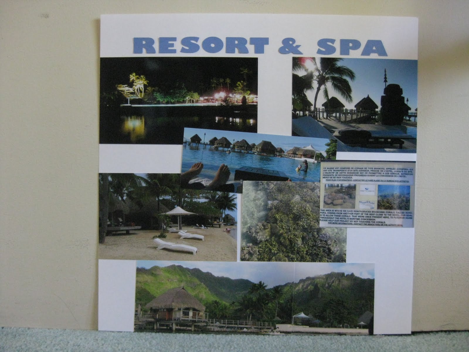
I decided to do a double layout for this. There were a lot of pictures taken around the resort. I chose the best pictures from my camera that represented the resort to create this page. With that many pictures, I decided to pick white as the page background. I used my digital cutter to cut out the letters from my computer.

I kept the page quite simple. I kept our room key as a souvenir to use for my scrapbook. I decided to divide my pictures in 2 sections. The layout on the left, I chose to use pictures inside the hotel, compared to the layout on the right, I used pictures of the outdoor - the beach, the pool, etc.

I loved the hallway/lobby of the hotel. It was an open hallway with no front door. It gave a very "opened" feeling while hanging around the lobby.

I love the infinity pool! If you look closely at the layout, you can see the picture in the middle. Because the day was so beautiful, the infinity pool reflected the overwater bungalows in the water. It actually gave an illusion. Several friends of ours got tricked by the camera as well.

We did a panoramic view of the resort's backdrop. However, I didn't get the it printed in panoramic view because I wasn't able to find the place to do it. When I found it, it was totally out of my budget! I decided to print the 2 pictures separately and attached them together. It fitted well and happy with the result.

If I could do something different to this page, I would like to put a journal tag on the layout. I would like to write about my overall feelings and experiences of the hotel.

Saturday, May 7, 2011

Lycee Agricole d' Opunohu

In Moorea, there is a agriculture school. The surrounding was beautiful, so green. We saw a lot of pineapples growing on the ground (Moorea is known to be the "Pineapple Island" after all), papaya trees, passion fruit trees, lime trees, and many more!

There, we were able to sample some of the jams that were made there. They tasted so good that we decided to buy some jams to take them home to enjoy. The day was pretty hot, so we decided to order a fruit juice to quench our thirst. After they made it, it looked really pretty in the glass. It was a two toned color- from orange to yellow. I regretted not buying a bag of vanilla beans. The vanilla beans had a very strong aroma. Our tour guide told us that if we put a strand of vanilla bean in a bottle of vodka and leave it there for a while, when you open the bottle of vodka, you will only be able to smell and taste vanilla, and not the alcohol. (Note: please don't take my advice for it. I only wrote what my tour guide told us. I didn't purchase any vanilla beans to experiment if it was true.)

I like to also point out that the time we were in Moorea, this place was giving us a better exchange rate compared to the bank. During the time we went, the bank gave us $1USD to about 80 CPF. However, at the school, they were giving us $1USD to 100 CPF. It had been about couple years since we were there. The exchange rate might had already changed. For those that are planning to travel to Moorea, I suggest not to exchange all your cash all at once in the bank at the airport. Save some cash, you may find better exchange rates from local stores.

I decided to do a double layout for this page. I used green and brown cardstock as background. I cut two 2-inch white strips to put across the top of the two pages. I cut out fonts from my digital cutter. I also added a dark green with white polka dots ribbon.


I kept this double layout really simple. I decided to choose the school name as the title for the pages. We took many different pictures.


I decided to keep the sizes of each picture uniformed. I had to cut down each picture to fit all 8 pictures on the layout.

This is the last layout for the 4x4 Safari Tour. I only took the highlights of the tour to put into my scrapbook. Our tour included a stop at the Pineapple Factory and Fruit Juice Distillery. We were able to sample some liquors and juice there. At the end of the trip, our tour guide took us to the pearl shop to shop for pearls.

It was a 4-5 hours trip. By the time when we finished the tour, most of the people in my group decided to stop by to nearby market, no more than 5 minutes walk from our hotel, to pick up some food or snacks. I forgot what we had, but I believed we bought ourselves a jambon baguette, and picked up a carton of pineapple juice to bring back to our room to enjoy lunch on our balcony.

Next time, a fancy dinner in the hotel. I was inspired by a scrapbook layout that I saw at a local scrapbook store, and decided to scrap-lift the page.

Wednesday, May 4, 2011

Magic Mountain


The locals called this place as "Magic Mountain." Our tour guide told us that it was private property. The road up to the top of the mountain was windy, and bumpy as the road wasn't paved! It was a one car road up and down the mountain. The driver had to be really careful of the opposite cars coming toward our direction. It was about a 15 minutes ride up to the mountain. It was worth the bumpiness! Tommy recorded on the camera the whole time of the journey up to the top. The view was gorgeous.

I decided to do a single layout for this page. I decided to use blue cardstock as the background and used a lighter blue color pattern paper to layer over the cardstock. I decided to use blue color for this layout because of the picture that was used for this page. I accented the page with white color. Blue and white colors can never go wrong in any layout! :)


I cut out the fonts from my digital cutter and used tape to tape down the letters onto the page.


I wrote a small journal on a white paper, then taped the white journal onto a lighter blue cardstock. I cut out a piece of ribbon long enough to cover the top of the tag and to make a bow. I randomly picked somewhere on the ribbon to create the bow. As you can see, the bow was more to the left side of the journal. That was because one side wasn't long enough if I were to put the ribbon down the middle.


I cut the corner flourish from my digital cutter. I used blue gems and randomly placed them on the flourish. I could probably could use a couple more gems to put on there.


I love this layout. I like the ribbon on the journal. I think having the bow on the side looked better than putting the bow in the middle.

Thursday, April 28, 2011

Pao Pao

Pao Pao is a small village in Moorea. It was our first stop of the Safari Tour. The tour guide drove off the main road to go to Pao Pao. He also gave a bit of history about the island, and talked about the volcano and crater. We saw pineapples grew along the road. (I love their Moorea pineapples and their pineapple juice!)

I decided to do a double layout. I chose to use the Citrus stack from DCWV. When I buy papers, if there is a matching paper stack with the cardstock, I would buy them both at the same time. That way, I don't have to frustrate myself with complimenting the colors.

I printed out letters from my silhouette digital cutter. I used a green pattern cardstock as background. The white flower patterns were in glitters! I decided to round the center picture with the corner punch.

For some odd reason, when I worked with cardstocks with glitters, my photo tape would not adhere to the back. It kept on falling off. I had to use runner tape to tape the corners.

Because the page was so bright with the lime green, that completely overpowered my letters. I thought about using another color to put behind the white letters to make it stand out. I decided not to.

One the other side of the layout, I kept the page really simple. I purchased a flower design from the digital cutter's website.

This was my first time cutting out a design which I needed to use more than one color to complete a design. I had to also do a little layering to create the flower. I kept the flower white to compliment the layout on the left.

I cut out a small frame with my digital cutter to give an illusion of a "journal" tag. I used stickers to spell out "Pao Pao" and wrote a few small facts about the village. I have a problem writing straight. It tends to move upward from left to right! I did eventually invest in an invisible ink pen to help me "eye" my lines to keep my work straight.

I was a bit disappointed me this page. This was one of the pages that I did went back and added more elements to make the page look better. Watch out for the post in the future!

Monday, April 18, 2011

Dining... with a View

"Dining with a View, " this title really said it all! It was our second day in Moorea and decided to hung out at the hotel property. We had a breakfast & dinner meal plan with the hotel. Since we went to the Tiki Village Theatre the night before, we asked the front desk if we could exchange one dinner for a lunch instead. They agreed. Well, that's how we ended up dining at the hotel's bar, overlooking the view with a glass of delicious pina colada and our 3 course meal.

In this layout, I decided to use two different color cardstock.

I hated the small fonts so much, I ended up cutting huge huge fonts to make sure I could use the runner tape easily!

For the left side of the layout, I decided to use pattern paper to cut the fonts and flourish out. It added color to the page. I love the color of the pattern paper!

The right side of the layout was a bit weak, to be honest. The page looked very plain, even with 3 strips of pattern paper running down the layout. There's something about the layout that didn't seem to go together. Till today, I find this page to be my least favorite!


I wrote a small journal along with the foods that we ordered on the right side of the layout. For a lunch, that was a really big lunch! On the left side, I wrote out the name of the restaurant we ate at and the date we dined. I used pattern paper behind both tags to add more colors.

If I were to go back and redo this layout, I would complete redo the entire layout! I would totally add a photo mats behind the 2 pictures on the left side. I probably would use green or blue cardstock for the photo mats. For the right side, I probably would redo the entire page. I would change it to the beige cardstock to match the one on the left side. I would probably keep the theme of blue and green to keep the page more "uniformed" looking. I probably would make the pictures turn a bit to give the page more of a "fun" look.

What I love about this page, I loved the pattern paper that I used to cut the letters and the flourish out! The two tone colors added a pop to the page.

Next time, another layout of the food we ate at another restaurant at the resort.

Wednesday, April 13, 2011

Air Moorea

Our travel itinerary did not include being in Tahiti. Once we cleared customs, we walked to other side of the airport to fly out to Moorea! Moorea was only 10 minutes away by plane! It was my first time to be flying in a 2-propellers plane. The view was amazing because the plane was flying a bit low, we could see the corals underneath the crystal clear water.

I decided to use grey color as background with orange accents. I chose that because I used the color based from one of the pictures taken and used for the layout. What caught my attention was the design of the Air Moorea. The plane was painted with orange hibiscus flowers. I purchased the hibiscus flower from silhouette and cut the design with orange cardstock paper to match the design on the plane. It was my first time to cut shapes other than fonts from the cutter. I picked out the grey background because the picture was a bit gloomy that morning.

I kept this page simple. I cascaded the pictures and wrote a small journal.

What I love about this page is the simplicity of the layout. I like the journal tag I created. The ribbon matched perfectly with the rest of the layout. There are some colors that I am not a big fan of, and I tend to keep the color to blue, green, white and black as they are more of the basic color for me to work with. The color orange considers to be quite daring, but I somehow pulled it off, and very happy with the result.

If I were to redo this page, only thing I would do is use a corner punch to round the corners of each picture. All three pictures were not cut into same size. I would make them all in equal length and width.

That's it for now. Follow me next time to see where Tommy and I headed to on our first day in Moorea!