Showing posts with label double layout. Show all posts

Saturday, July 16, 2011

Dinner @ Mahana'i

For the entire 4 nights stay in Moorea, Tommy ate at the resort for dinner, other than the dinner & show on our first night. Mahana'i is the main restaurant at the Moorea Pearl. I had scraped quite a bit of food pages in my Tahiti scrapbook. I probably had scraped at least 3 different layouts of my dining experience at Mahana'i. We dined there for 2 nights.

Tommy and I love to try a bit of everything, when possible. We made sure for all our dinners, we would not order the same thing on the menu so we could try different plates. We also made sure that we would not order the same thing as the other night we dined there.

This page was quite special to me because Tommy helped out in creating this double layout with me. He was recovering a minor surgery at his home. I wanted to spend more time with him and wanted to help him put his mind off the pain, so I decided to work on a layout together - from brainstorming how we wanted the page to look to the color coordination.

Although this is probably not the best page out of the entire Tahiti scrapbook, it's nice that Tommy was involved in it to help me out. After this page, I am pretty sure he won't be helping me much.

We decided to do a double page layout. One side consisted of the order that Tommy ordered, and the other side consisted of the order I ordered. We also wrote a little journal about our dining experience.


We decided to choose brown cardstock as our background of our double layout. The reason why we wanted to use the brown cardstock was because we wanted to resemble the background as the color of the table that we sat at.

We chose a silver metallic cardstock because there was a place mat on the table where we dined. The place mat was shimmery, metallic. The design of the place mat had a checkered design with 2 different colors -- brown/gold with green/silvery tone.

I used my silhouette cutter to cut out the letters. We decided to use black as the font on the left side of the layout.

To keep it a bit more interesting, Tommy wanted to use a yellow star epoxy sticker to replace the dot on the letter "i."

We arranged the pictures from top to bottom (appetizer- dinner- dessert). We also resized all 6 pictures .


With the way how we arranged the pictures on one side, it gave us enough space in the middle to write a small journal. I tripled layered the journal. I started with a black cardstock, which I used the round corner punch to punch out the 2 corners. Then, I layered a greenish metallic cardstock over the black cardstock.

I had Tommy wrote his experience on a small cardstock. After he was done, I layered his journal on top of the green metallic cardstock. I used a gold color brad as decoration.

The second side of the layout was basically the same as the one on the left. I put the pictures the same way like the other side, expect "mirrored."

I used a green metallic cardstock to cut out the font from my digital cutter.


The "@" sign, I actually it 2 times with the 2 different cardstock. Originally, I wanted to cut the "@" sign down the middle and adhere right at the edge of the page with 2 colors.

Tommy talked me out of it and decided that it would look better if we use the black font instead and adhere it completely onto one side of the page. Again, he decided to use epoxy sticker at the end.

Just like the other side, I wrote my dining experience. I tried to keep the two pages identical in design. It looked like a mirror reflection.


Saturday, May 21, 2011

4x4 Safari Tour - Page 2

The thing about this scrapbook, I knew exactly what layouts I wanted to do. I would use a post it note and stick it on the album to remind myself of the events/ activities that I wanted to scrap about. I decided to create a collage of Tommy and me on the Safari Tour.


I decided to go with the green cardstock as background. It is the same background used for the layout next to it - 4x4 Safari Tour. I also used the same 2 pattern papers to create this page. I decided to tear the papers. In the center of the layout, I wrote down all the stops we had during the tour. I used 4 brads for each corner to make the center look like a "board."

Next week, if time permits, I will post another page. I am going on a vacation, and I need to start planning my trip and start thinking what to pack. :)

Wednesday, May 11, 2011

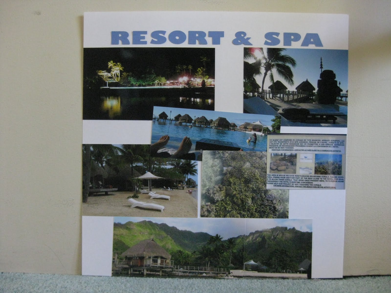
Moorea Pearl Resort & Spa


We stayed at the Moorea Pearl & Resort while we were in Moorea. I knew how the hotel was going to look like prior to trip. I was curious and did my research on YouTube. When I got there, it looked so surreal to me. I still couldn't believe that we were actually in Tahiti! When we entered the hotel, we were being greeted with the friendly staffs, a glass of delicious pineapple juice and a tiare flower.

We spent 4 nights in Moorea in the Garden View Room. Our room was on the 2nd floor. When we stepped out of our balcony, we could see the view of the garden. It was quite peaceful. However, I recommend that you bring bug spray. Those little mosquitoes loved to eat! Just by walking through the path at night back to our room after dinner, I ended up getting a couple bug bites here and there! They were very itchy too! We had to go to a pharmacy to pick up anti-itch gel to soothe the itching! The anti-itch gel really helped. I think we even picked up tamanu oil while shopping at the juice factory (yes, the juice factory not only sold tourists fruit juices, they sold them souvenir).

I decided to do a double layout for this. There were a lot of pictures taken around the resort. I chose the best pictures from my camera that represented the resort to create this page. With that many pictures, I decided to pick white as the page background. I used my digital cutter to cut out the letters from my computer.

I kept the page quite simple. I kept our room key as a souvenir to use for my scrapbook. I decided to divide my pictures in 2 sections. The layout on the left, I chose to use pictures inside the hotel, compared to the layout on the right, I used pictures of the outdoor - the beach, the pool, etc.

I loved the hallway/lobby of the hotel. It was an open hallway with no front door. It gave a very "opened" feeling while hanging around the lobby.

I love the infinity pool! If you look closely at the layout, you can see the picture in the middle. Because the day was so beautiful, the infinity pool reflected the overwater bungalows in the water. It actually gave an illusion. Several friends of ours got tricked by the camera as well.

We did a panoramic view of the resort's backdrop. However, I didn't get the it printed in panoramic view because I wasn't able to find the place to do it. When I found it, it was totally out of my budget! I decided to print the 2 pictures separately and attached them together. It fitted well and happy with the result.

If I could do something different to this page, I would like to put a journal tag on the layout. I would like to write about my overall feelings and experiences of the hotel.

Monday, May 9, 2011

Le Matiehani

With a little extra money to pay on top of the meal plan, Tommy and I decided to make a reservation at Le Matiehani, resort's fancy restaurant. We both enjoyed the dinner. The restaurant had about 4-5 tables in the main dining area, and a couple tables outside. We were actually the only couple sitting inside the dining area. It felt like we were in Chinese Soap Opera, where the rich guy reserved the entire restaurant to take his date out for nice dinner, and perhaps even had a rock in his pocket. It was a picture perfect scenario! That didn't happen to us! We just happened to be the only one in the main dining room dining. Either Tommy nor I are rich enough to reserve the entire restaurant just to cater to us. Lastly, hunnie got no rock in his pocket to seal the picture perfect moment! :(

I decided to do a double layout. I made a fancier looking page on one side, and on the other side, I decided make a page of the food we ordered. I used 2 black cardstock papers as the background and used a glitter orange cardstock to layer on top of the black background.

While I was shopping at one of my local scrapbook stores, I noticed they hung a layout on the wall that I couldn't keep my eyes off it. I was inspired by it, and decided to shop in the store for the necessary materials to make my page.

I scroll through my pictures on my iPhone and found the picture that I wanted to use for my layout. From the picture, I chose a color and work along with it to incorporate it with my layout.

The layout above is not 100% exactly the same as the layout I saw at the scrapbook store. It was almost the same concept, but slightly different.

I used a pencil to draw a curve line over the orange cardstock and used a pair of scissor to cut along the line. I kept the top part, and kept the rest of the unused paper in my scrap box for future use. I adhere the picture onto the page and added flowers along the edge where the 2 papers met. I randomly picked different colors and sizes flowers and randomly placed them along the edge. I used runner tapes to adhere the flowers onto the page and added pearls in the center of each flower.

I cut the fonts out from my digital cutter. I decided to size the letters in bigger font to put the title across the page.

On the right side of the layout, I arranged the photos according to appetizer - main course - dessert. I separated our orders. Can you guess which one side was mine?

This page had a lot of pictures and overloaded with information. I kept this page simple. I resized all 6 pictures. I rounded the top right corner of the appetizer picture on the left, the top left corner of the appetizer picture on the right. I also rounded the bottom right corner of the dessert picture on the left as well as the bottom left corner of the dessert picture on the right. I only rounded 4 corners to give a softer edgy look on this layout.


Because I resized the pictures, there was extra space on the bottom of the layout. I found an orange with yellow dots ribbon. The color of the ribbon complimented the layout on the left. I decided to put the ribbon on the bottom of the page on the right.


I purchased a jar of flowers for the layout on the left. Because there were quite a bit of the flowers, I didn't use them all up for the layout. Since there were extra flowers in different color and sizes, I decided to layer the flowers in 3 different sizes to create a giant flower embellishment. I also added a pearl in the middle. I used runner tape to adhere all the flowers together.


We probably spent over 2 hours dining at the restaurant that evening. People in French Polynesia was very relaxed and easy going. We tried to be like them, take things slow and enjoy life. Our dining experience was great, and the food was delicious. With just an additional amount of money to pay for the dinner, it felt like that our meal was a steal! We surely enjoyed our dining experience at Le Matiehani.

Saturday, May 7, 2011

Lycee Agricole d' Opunohu

In Moorea, there is a agriculture school. The surrounding was beautiful, so green. We saw a lot of pineapples growing on the ground (Moorea is known to be the "Pineapple Island" after all), papaya trees, passion fruit trees, lime trees, and many more!

There, we were able to sample some of the jams that were made there. They tasted so good that we decided to buy some jams to take them home to enjoy. The day was pretty hot, so we decided to order a fruit juice to quench our thirst. After they made it, it looked really pretty in the glass. It was a two toned color- from orange to yellow. I regretted not buying a bag of vanilla beans. The vanilla beans had a very strong aroma. Our tour guide told us that if we put a strand of vanilla bean in a bottle of vodka and leave it there for a while, when you open the bottle of vodka, you will only be able to smell and taste vanilla, and not the alcohol. (Note: please don't take my advice for it. I only wrote what my tour guide told us. I didn't purchase any vanilla beans to experiment if it was true.)

I like to also point out that the time we were in Moorea, this place was giving us a better exchange rate compared to the bank. During the time we went, the bank gave us $1USD to about 80 CPF. However, at the school, they were giving us $1USD to 100 CPF. It had been about couple years since we were there. The exchange rate might had already changed. For those that are planning to travel to Moorea, I suggest not to exchange all your cash all at once in the bank at the airport. Save some cash, you may find better exchange rates from local stores.

I decided to do a double layout for this page. I used green and brown cardstock as background. I cut two 2-inch white strips to put across the top of the two pages. I cut out fonts from my digital cutter. I also added a dark green with white polka dots ribbon.


I kept this double layout really simple. I decided to choose the school name as the title for the pages. We took many different pictures.


I decided to keep the sizes of each picture uniformed. I had to cut down each picture to fit all 8 pictures on the layout.

This is the last layout for the 4x4 Safari Tour. I only took the highlights of the tour to put into my scrapbook. Our tour included a stop at the Pineapple Factory and Fruit Juice Distillery. We were able to sample some liquors and juice there. At the end of the trip, our tour guide took us to the pearl shop to shop for pearls.

It was a 4-5 hours trip. By the time when we finished the tour, most of the people in my group decided to stop by to nearby market, no more than 5 minutes walk from our hotel, to pick up some food or snacks. I forgot what we had, but I believed we bought ourselves a jambon baguette, and picked up a carton of pineapple juice to bring back to our room to enjoy lunch on our balcony.

Next time, a fancy dinner in the hotel. I was inspired by a scrapbook layout that I saw at a local scrapbook store, and decided to scrap-lift the page.

Saturday, April 30, 2011

Cooks Bay, Opunohu Bay

It is a single layout for each of the two bays, but it's also a double layout for me. I intended to put the two bays layouts next to each other because when I was on the tour, I learned that the bays were separated by the mountain, Mt. Rotui. With that in mind, I wanted to put both of them next each other.

For the Cook's Bay layout, I decided to use blue cardstock as a background. I used a lighter blue pattern paper to layer on top of the cardstock. I cut out letters with my digital cutter and layered it over the blue pattern paper. I adhered the pictures onto the page and added a ribbon to the layout.
The ribbon matched the color of the 2 papers near perfectly. The ribbon helped blend the 2 papers together. I absolutely loved this ribbon! :)

For this layout, I decided to stick with a green theme. It was mainly because the pictures had alot green colors. I decided to do a similar layout to match with the Cook's Bay layout. I decided to layer a pattern green paper over the green cardstock. I also cropped the bottom 2 pictures so they could fit inside the pattern paper.

I used my digital cutter to cut out the fonts. I used a different font from the layout because the name, Opunohu Bay, was much longer than Cook's Bay. I wanted to use the same font, but it turned out I couldn't fit the entire title to my layout, I had to decide on a next plan.

Thursday, April 28, 2011

Pao Pao

Pao Pao is a small village in Moorea. It was our first stop of the Safari Tour. The tour guide drove off the main road to go to Pao Pao. He also gave a bit of history about the island, and talked about the volcano and crater. We saw pineapples grew along the road. (I love their Moorea pineapples and their pineapple juice!)

I decided to do a double layout. I chose to use the Citrus stack from DCWV. When I buy papers, if there is a matching paper stack with the cardstock, I would buy them both at the same time. That way, I don't have to frustrate myself with complimenting the colors.

I printed out letters from my silhouette digital cutter. I used a green pattern cardstock as background. The white flower patterns were in glitters! I decided to round the center picture with the corner punch.

For some odd reason, when I worked with cardstocks with glitters, my photo tape would not adhere to the back. It kept on falling off. I had to use runner tape to tape the corners.

Because the page was so bright with the lime green, that completely overpowered my letters. I thought about using another color to put behind the white letters to make it stand out. I decided not to.

One the other side of the layout, I kept the page really simple. I purchased a flower design from the digital cutter's website.

This was my first time cutting out a design which I needed to use more than one color to complete a design. I had to also do a little layering to create the flower. I kept the flower white to compliment the layout on the left.

I cut out a small frame with my digital cutter to give an illusion of a "journal" tag. I used stickers to spell out "Pao Pao" and wrote a few small facts about the village. I have a problem writing straight. It tends to move upward from left to right! I did eventually invest in an invisible ink pen to help me "eye" my lines to keep my work straight.

I was a bit disappointed me this page. This was one of the pages that I did went back and added more elements to make the page look better. Watch out for the post in the future!

Monday, April 25, 2011

4x4 Safari Tour

The 4x4 Safari Tour was our only guided tour we booked in Moorea. If we had more time, and if the sky was the limit when it came to money, I would totally do Shark & Ray feeding, or Dolphin & Whale tour with Dr. Poole, etc. However, with limited time and money, we chose to do a Safari Tour. I believed I made the right decision when I tried to convince Tommy to do a 4x4 Tour! The island was so beautiful and green! It was breathtaking. (You will just have to stay tune for the layouts to see!)

The colors, blue & green, was based on the picture I used for this layout. I cut out the letters from the Silhouette digital cutter. I cut the letters a bit bigger so I could easily tape down the letters onto my layout.

I kept the layout simple by cutting 2 blue squares from a pattern paper to create a grid for the background. I chose a brighter green pattern paper for the center of the page. It created a focus to the center of the layout.

I used 3-d foams to raise the "4x4" letters.

The embellishment that I used for this layout was the Jolee's Boutique Safari dimensional stickers.

If I were to work on this layout again, I would make the date of the event smaller. I would also move the picture down, so the top half of the page is not so cramped together.

Wednesday, April 20, 2011

Mahana'i

Because of the meal plan with the hotel, we didn't get a chance to explore the local eateries in Moorea. When the sun went down, we were not able to go anywhere because it was dark out. We didn't have a car either. So, we spent our evenings at the hotel to relax. This was our first dinner at the hotel.

For this layout, I decided to do a double layout with the pictures of the food we ordered for that evening. The page was simple and I liked the way it turned out.

I decided to use a pattern cardstock paper as the background. I chose a blue metallic cardstock as a photo mat. I cut the flourish with my silhouette cutter and used silver metallic cardstock to give it a slight pop & color to the layout.

I cropped the six food pictures into the same size and arranged it according to appetizer, main course, dessert, and separated what I ordered from Tommy's. With all the cropping of the pictures, I ended up with a big gap of space down in the middle. I decided to use the silver metallic cardstock and cut out the name of the restaurant, Mahana'i to fill the gap in the middle. Again, I used the silhouette cutter.

I debated if I should round the corners at the time when I was putting this layout together, but I decided not to and kept the straight corners instead. If I could work on this page again, I would add flowers and gems to the left side of the page.

Hope you are all enjoying your week!

Monday, April 18, 2011

Dining... with a View

"Dining with a View, " this title really said it all! It was our second day in Moorea and decided to hung out at the hotel property. We had a breakfast & dinner meal plan with the hotel. Since we went to the Tiki Village Theatre the night before, we asked the front desk if we could exchange one dinner for a lunch instead. They agreed. Well, that's how we ended up dining at the hotel's bar, overlooking the view with a glass of delicious pina colada and our 3 course meal.

In this layout, I decided to use two different color cardstock.

I hated the small fonts so much, I ended up cutting huge huge fonts to make sure I could use the runner tape easily!

For the left side of the layout, I decided to use pattern paper to cut the fonts and flourish out. It added color to the page. I love the color of the pattern paper!

The right side of the layout was a bit weak, to be honest. The page looked very plain, even with 3 strips of pattern paper running down the layout. There's something about the layout that didn't seem to go together. Till today, I find this page to be my least favorite!


I wrote a small journal along with the foods that we ordered on the right side of the layout. For a lunch, that was a really big lunch! On the left side, I wrote out the name of the restaurant we ate at and the date we dined. I used pattern paper behind both tags to add more colors.

If I were to go back and redo this layout, I would complete redo the entire layout! I would totally add a photo mats behind the 2 pictures on the left side. I probably would use green or blue cardstock for the photo mats. For the right side, I probably would redo the entire page. I would change it to the beige cardstock to match the one on the left side. I would probably keep the theme of blue and green to keep the page more "uniformed" looking. I probably would make the pictures turn a bit to give the page more of a "fun" look.

What I love about this page, I loved the pattern paper that I used to cut the letters and the flourish out! The two tone colors added a pop to the page.

Next time, another layout of the food we ate at another restaurant at the resort.

Saturday, April 16, 2011

Tiki Village Theatre

Our first activity in Moorea was visiting the Tiki Village Theatre. Before flying to Tahiti, we had it planned out where we were going to go in Moorea. I told Tommy that I wanted to visit the cultural center during the day time and returning back to the village for their Polynesian buffet dinner and dance show in the evening. We scheduled with the cultural center to pick us up from our hotel. The driver was one of the nicest girl I had met in Moorea, but I had forgotten her name! They gave us a tour of the center, showed us the arts and crafts that they made and we even sat in an outrigger to see the pearl farm demonstration!

I kept my layout simple. I used brown cardstock as background and used red cardstock to cut out letters and borders. The most difficult part was putting the "Polynesian Buffet & Dance" letters onto the page. The fonts were small and I had to manually pull out each strip of tape to put it on the back of the letter. That was really tedious work! I think this was the page where I told myself, "no more small letters because I am going to break my back and my eyes will go bad!"
It was my first time to cut out a border from my digital cutter. It was so quick and easy! I couldn't have done this kind of intricate cutting with a pair of scissor! With that border, it gave an instant feel of being in a tropical island!

The right side of my double layout, I decided to put different pictures we took at the cultural center.

My intention of this page was to create a pocket and put the dinner & show program that I collected inside. The downside of this was not being able to pull it out because I didn't come up with a solution on how to access that map easily! On top of the pocket, I decided to journal about our adventure at the Tiki Village Theatre.

Enjoy!

Monday, April 11, 2011

LAX - PPT

I gave some thought on how to blog about my first album. I decided that I would blog according to the date I completed each layout.

I started this layout when Tommy left on a 3 day Mexico cruise with his friend's bachelor's party. Since I had free time to myself, I decided that it was the best time for me to start working my first album.

In this album, I really wanted to document as much as possible on everything we did. It was a once in a lifetime opportunity to go to Tahiti! I definitely needed to make sure I could preserve all my memories so when I am 90 years old, I could relive my vacation through my scrapbook!

I decided to do a double layout for the departure of LAX (LA International airport) to the arrival at PPT (Tahiti International Airport).

I kept the layout quite simple. I used 2 different shades of blue, that resembled the color of chairs on the Air Tahiti Nui's plane. I cut out all letters with the silhouette cutter. The difficult part of putting the letters on the layout was trying to center them!

We took alot of food pictures in Tahiti, even airline foods! Since I never get to enjoy my food on the plane, it was kind of nice to remember what kind of food they were offering. It was a red-eye flight to Tahiti, I also made a small note on the layout to indicate what time we flew out from LAX. I could only remember falling asleep while the plane was in line to take off the runway. It felt as if I slept for over an hour!

When we got to Tahiti, it was 4AM! I definately had to document that because when we got off the plane, there were 3 guys playing Tahitian music and airport staffs passing out tiare flowers at the crack of dawn to welcome us right when we entered the airport to go through customs & immgrations! That was pretty cool.

I didn't do much to this page. I kept the page really simple for my first layout as I was still trying to figure things out.