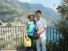
 Oh, the mountain that sits in between the 2 bays! They called it as "Belvedere Lookout." The view was amazing! I love this picture.
This was a single layout page. I decided to use a green cardstock as background and use a blue, green pattern paper as a foreground of this layout. I kept the layering very simple. I cut the pattern paper into 11x11. I made mats for the photo and the journal.
 The only embellishment that I added to the page was the flower brad. It was a green flower with purple accent in the middle. It drew the attention to the journal when I looked at the layout.
I love this page alot. It was a very simple looking layout. I wouldn't do anything to change the layout of this page. I believed I had trouble lining things up in the middle. If you look closely at the layout, you will see that it panned to the left.
Next time, another single layout, almost similar to this one.
Have a great day! :)


No comments:
Post a Comment