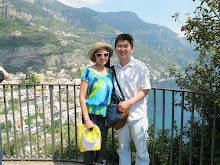
 Santa Ynez was my first wine tasting trip with Tommy. Believe it or not, after this trip, we fell in love of doing wine tasting tours and had to go to Napa Valley a month after. After we left Ojai, we drove up to Santa Ynez Valley for wine tasting. We watched the movie, "Sideways," and we picked two wineries off their list to visit.
This was a simple layout. I used only one sheet of cardstock as the background. I chose brown as the background because of the pictures in the background. Not only that, we went to visit in September, the beginning of Fall season. I wanted to use "earthy" tones for my layout.
I cut out fonts from my Silhouette cutter. Some of the fonts were smaller and they were difficult to put on the page because I didn't have the right tools to adhere them. When it comes to scrapbooking, I don't like to use glue unless it is absolutely necessary. I use runner tapes to tape everything down on the page. Not until I was 1/3 way into working on my first travel album, I decided to pick up the Xyron X to make my life easier.
For the smaller fonts, I had to pick out tiny stripes off the runner tapes and add the tapes to the font one by one by hand. I had to carefully place the tapes on each letter and had to make sure the tapes were not showing on the edges of each font.
 The problem about this page was the printout of the wine map. I tri-folded the map, added a ribbon to wrap around the map, and taped the back of map to the layout. If the page doesn't have a protector cover, this would work. However, all my albums have protector covers for each sheet. I will have to cut a hole on the protector cover so I can access the map. When I have time, I will put try to figure out what to do.
 As for embellishment, I decided to use rub-on to keep the page simple. The great thing about rub-ons is how simple it is to transfer designs to the project. All I need is a popsicle stick and continue to rub the design off the sheet. If done correctly, the entire design gets transferred to the project!
If I were to fix this layout, I would add frames to the pictures and round the corners with the corner punch. I would probably shrink the map to keep the entire map flat on the layout without the need to fold and write out the places we went on a tag.
Happy Monday!


No comments:
Post a Comment