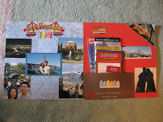
 Last time I went to San Francisco, I was probably 10 years old. Time surely flew by quickly! Nevertheless, it brought back some good memories, and created some new memories with Tommy. There were places in San Francisco that I had never been to, and was able to visit the second time.
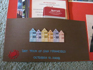
The double layout didn't take too long to put together, but I surely had a difficult time putting it together because I didn't know what I wanted to do, and how I wanted to put the page together. There were quite a bit of pictures that I wanted to use, but didn't know how to incorporate it in a double layout. I believe this was my first time to use many different pictures for a layout and my first time to create a pocket.
 I bought the Jolee's Boutique Title Wave of San Francisco and decided to use it as a title for my page. I used a blue pattern as background. During the time I was putting this page together, I still had not really figured out how to mix and match different papers. I used 5 different pictures for this layout. I should cut all the pictures to the same size to keep it uniformed.
 Besides the title wave sticker, I also used Jolee's Boutique Themed Destination Stickers of San Francisco to add embellishments to my page.
The hardest part of this page was creating the pocket. I thought the pocket was simple to put together. I thought I only needed to tape down 3 sides, and leave a little space, and I created a pocket! I didn't take into account of putting a bunch of brochures which the sides kept detaching on its own.
I really liked the title wave and the pocket. Of the two pages, I enjoyed the left side. If I could redo my layout, I would definitely fix the pocket so it would not detach on its own. I would completely redo the entire layout on the right side! It felt too empty to me.
Next time, a post for the single layout that I used my Silhouette digital cutter for the first time.


No comments:
Post a Comment