Saturday, April 30, 2011

Cooks Bay, Opunohu Bay

It is a single layout for each of the two bays, but it's also a double layout for me. I intended to put the two bays layouts next to each other because when I was on the tour, I learned that the bays were separated by the mountain, Mt. Rotui. With that in mind, I wanted to put both of them next each other.

For the Cook's Bay layout, I decided to use blue cardstock as a background. I used a lighter blue pattern paper to layer on top of the cardstock. I cut out letters with my digital cutter and layered it over the blue pattern paper. I adhered the pictures onto the page and added a ribbon to the layout.
The ribbon matched the color of the 2 papers near perfectly. The ribbon helped blend the 2 papers together. I absolutely loved this ribbon! :)

For this layout, I decided to stick with a green theme. It was mainly because the pictures had alot green colors. I decided to do a similar layout to match with the Cook's Bay layout. I decided to layer a pattern green paper over the green cardstock. I also cropped the bottom 2 pictures so they could fit inside the pattern paper.

I used my digital cutter to cut out the fonts. I used a different font from the layout because the name, Opunohu Bay, was much longer than Cook's Bay. I wanted to use the same font, but it turned out I couldn't fit the entire title to my layout, I had to decide on a next plan.

Thursday, April 28, 2011

Pao Pao

Pao Pao is a small village in Moorea. It was our first stop of the Safari Tour. The tour guide drove off the main road to go to Pao Pao. He also gave a bit of history about the island, and talked about the volcano and crater. We saw pineapples grew along the road. (I love their Moorea pineapples and their pineapple juice!)

I decided to do a double layout. I chose to use the Citrus stack from DCWV. When I buy papers, if there is a matching paper stack with the cardstock, I would buy them both at the same time. That way, I don't have to frustrate myself with complimenting the colors.

I printed out letters from my silhouette digital cutter. I used a green pattern cardstock as background. The white flower patterns were in glitters! I decided to round the center picture with the corner punch.

For some odd reason, when I worked with cardstocks with glitters, my photo tape would not adhere to the back. It kept on falling off. I had to use runner tape to tape the corners.

Because the page was so bright with the lime green, that completely overpowered my letters. I thought about using another color to put behind the white letters to make it stand out. I decided not to.

One the other side of the layout, I kept the page really simple. I purchased a flower design from the digital cutter's website.

This was my first time cutting out a design which I needed to use more than one color to complete a design. I had to also do a little layering to create the flower. I kept the flower white to compliment the layout on the left.

I cut out a small frame with my digital cutter to give an illusion of a "journal" tag. I used stickers to spell out "Pao Pao" and wrote a few small facts about the village. I have a problem writing straight. It tends to move upward from left to right! I did eventually invest in an invisible ink pen to help me "eye" my lines to keep my work straight.

I was a bit disappointed me this page. This was one of the pages that I did went back and added more elements to make the page look better. Watch out for the post in the future!

Tuesday, April 26, 2011

Bargain Shopping


Over the weekend, Tommy and I had one of those "nothing to do" weekend. I decided to do some shopping. We stopped by to Big Lots. My eyes twinkled when I saw the scrapbook section. I decided pick up the photo mat stack (Mango Frost) from DCWV. It has many pretty, happy colors.

I picked up some rain dots from Cloud 9. I haven't figure out what to do with them yet. They are small and compact enough to put it in my drawer.

At Big Lots, I also picked up some brads. They were in gems and pearls. I love to add blings and pearls as accents to my layouts or to my flowers.

After Big Lots, Tommy finally took me to the scrapbook store to do some shopping there. I had been wanting to go, but he always found ways to skip it. I picked up a bottle of Glimmer Mist. It has a pretty bold pink color. I also bought the Glimmer Glaze. I never used the glaze before, but I saw the cardboard samples that they had out, I wanted a bottle to give it a try. I will dedicate a weekend to learn how to use the glaze. I will also learn the different techniques on how to use the mists.

Lastly, I signed up for the So Cal Shop Hop. This is my first shop hop event, I am looking forward to see what new stuff I get to buy from different scrapbook stores. With that said, I will start saving money from now to the start of the event so I don't have to feel guilty paying my credit bills later.

Monday, April 25, 2011

4x4 Safari Tour

The 4x4 Safari Tour was our only guided tour we booked in Moorea. If we had more time, and if the sky was the limit when it came to money, I would totally do Shark & Ray feeding, or Dolphin & Whale tour with Dr. Poole, etc. However, with limited time and money, we chose to do a Safari Tour. I believed I made the right decision when I tried to convince Tommy to do a 4x4 Tour! The island was so beautiful and green! It was breathtaking. (You will just have to stay tune for the layouts to see!)

The colors, blue & green, was based on the picture I used for this layout. I cut out the letters from the Silhouette digital cutter. I cut the letters a bit bigger so I could easily tape down the letters onto my layout.

I kept the layout simple by cutting 2 blue squares from a pattern paper to create a grid for the background. I chose a brighter green pattern paper for the center of the page. It created a focus to the center of the layout.

I used 3-d foams to raise the "4x4" letters.

The embellishment that I used for this layout was the Jolee's Boutique Safari dimensional stickers.

If I were to work on this layout again, I would make the date of the event smaller. I would also move the picture down, so the top half of the page is not so cramped together.

Saturday, April 23, 2011

2010 Cruise

A collage of all the layouts I made for the Post Cruise Album

If you have been following my twitter, you noticed that I had been busy working on my Post Cruise Album. It took me about 2.5 months to complete my album for the post cruise part. I am very excited and can't wait to show you what I did with my layouts. However, you will just have to keep checking back or follow my blog as I am posting my Tahiti album right now.

Exactly a year ago, April 23, 2010, it was the day that our Europe experience began. I thought to myself, to commemorate such memorable event (we were worried that we couldn't fly out because of the eruption of Eyjafjallajökull in Iceland), there's no better posts other than a little teaser of my new completed album to keep the "magic" alive.

Happy Saturday! Hope you are all enjoying your weekend! :)

Wednesday, April 20, 2011

Mahana'i

Because of the meal plan with the hotel, we didn't get a chance to explore the local eateries in Moorea. When the sun went down, we were not able to go anywhere because it was dark out. We didn't have a car either. So, we spent our evenings at the hotel to relax. This was our first dinner at the hotel.

For this layout, I decided to do a double layout with the pictures of the food we ordered for that evening. The page was simple and I liked the way it turned out.

I decided to use a pattern cardstock paper as the background. I chose a blue metallic cardstock as a photo mat. I cut the flourish with my silhouette cutter and used silver metallic cardstock to give it a slight pop & color to the layout.

I cropped the six food pictures into the same size and arranged it according to appetizer, main course, dessert, and separated what I ordered from Tommy's. With all the cropping of the pictures, I ended up with a big gap of space down in the middle. I decided to use the silver metallic cardstock and cut out the name of the restaurant, Mahana'i to fill the gap in the middle. Again, I used the silhouette cutter.

I debated if I should round the corners at the time when I was putting this layout together, but I decided not to and kept the straight corners instead. If I could work on this page again, I would add flowers and gems to the left side of the page.

Hope you are all enjoying your week!

Monday, April 18, 2011

Dining... with a View

"Dining with a View, " this title really said it all! It was our second day in Moorea and decided to hung out at the hotel property. We had a breakfast & dinner meal plan with the hotel. Since we went to the Tiki Village Theatre the night before, we asked the front desk if we could exchange one dinner for a lunch instead. They agreed. Well, that's how we ended up dining at the hotel's bar, overlooking the view with a glass of delicious pina colada and our 3 course meal.

In this layout, I decided to use two different color cardstock.

I hated the small fonts so much, I ended up cutting huge huge fonts to make sure I could use the runner tape easily!

For the left side of the layout, I decided to use pattern paper to cut the fonts and flourish out. It added color to the page. I love the color of the pattern paper!

The right side of the layout was a bit weak, to be honest. The page looked very plain, even with 3 strips of pattern paper running down the layout. There's something about the layout that didn't seem to go together. Till today, I find this page to be my least favorite!


I wrote a small journal along with the foods that we ordered on the right side of the layout. For a lunch, that was a really big lunch! On the left side, I wrote out the name of the restaurant we ate at and the date we dined. I used pattern paper behind both tags to add more colors.

If I were to go back and redo this layout, I would complete redo the entire layout! I would totally add a photo mats behind the 2 pictures on the left side. I probably would use green or blue cardstock for the photo mats. For the right side, I probably would redo the entire page. I would change it to the beige cardstock to match the one on the left side. I would probably keep the theme of blue and green to keep the page more "uniformed" looking. I probably would make the pictures turn a bit to give the page more of a "fun" look.

What I love about this page, I loved the pattern paper that I used to cut the letters and the flourish out! The two tone colors added a pop to the page.

Next time, another layout of the food we ate at another restaurant at the resort.

Saturday, April 16, 2011

Tiki Village Theatre

Our first activity in Moorea was visiting the Tiki Village Theatre. Before flying to Tahiti, we had it planned out where we were going to go in Moorea. I told Tommy that I wanted to visit the cultural center during the day time and returning back to the village for their Polynesian buffet dinner and dance show in the evening. We scheduled with the cultural center to pick us up from our hotel. The driver was one of the nicest girl I had met in Moorea, but I had forgotten her name! They gave us a tour of the center, showed us the arts and crafts that they made and we even sat in an outrigger to see the pearl farm demonstration!

I kept my layout simple. I used brown cardstock as background and used red cardstock to cut out letters and borders. The most difficult part was putting the "Polynesian Buffet & Dance" letters onto the page. The fonts were small and I had to manually pull out each strip of tape to put it on the back of the letter. That was really tedious work! I think this was the page where I told myself, "no more small letters because I am going to break my back and my eyes will go bad!"
It was my first time to cut out a border from my digital cutter. It was so quick and easy! I couldn't have done this kind of intricate cutting with a pair of scissor! With that border, it gave an instant feel of being in a tropical island!

The right side of my double layout, I decided to put different pictures we took at the cultural center.

My intention of this page was to create a pocket and put the dinner & show program that I collected inside. The downside of this was not being able to pull it out because I didn't come up with a solution on how to access that map easily! On top of the pocket, I decided to journal about our adventure at the Tiki Village Theatre.

Enjoy!

Wednesday, April 13, 2011

Air Moorea

Our travel itinerary did not include being in Tahiti. Once we cleared customs, we walked to other side of the airport to fly out to Moorea! Moorea was only 10 minutes away by plane! It was my first time to be flying in a 2-propellers plane. The view was amazing because the plane was flying a bit low, we could see the corals underneath the crystal clear water.

I decided to use grey color as background with orange accents. I chose that because I used the color based from one of the pictures taken and used for the layout. What caught my attention was the design of the Air Moorea. The plane was painted with orange hibiscus flowers. I purchased the hibiscus flower from silhouette and cut the design with orange cardstock paper to match the design on the plane. It was my first time to cut shapes other than fonts from the cutter. I picked out the grey background because the picture was a bit gloomy that morning.

I kept this page simple. I cascaded the pictures and wrote a small journal.

What I love about this page is the simplicity of the layout. I like the journal tag I created. The ribbon matched perfectly with the rest of the layout. There are some colors that I am not a big fan of, and I tend to keep the color to blue, green, white and black as they are more of the basic color for me to work with. The color orange considers to be quite daring, but I somehow pulled it off, and very happy with the result.

If I were to redo this page, only thing I would do is use a corner punch to round the corners of each picture. All three pictures were not cut into same size. I would make them all in equal length and width.

That's it for now. Follow me next time to see where Tommy and I headed to on our first day in Moorea!

Monday, April 11, 2011

LAX - PPT

I gave some thought on how to blog about my first album. I decided that I would blog according to the date I completed each layout.

I started this layout when Tommy left on a 3 day Mexico cruise with his friend's bachelor's party. Since I had free time to myself, I decided that it was the best time for me to start working my first album.

In this album, I really wanted to document as much as possible on everything we did. It was a once in a lifetime opportunity to go to Tahiti! I definitely needed to make sure I could preserve all my memories so when I am 90 years old, I could relive my vacation through my scrapbook!

I decided to do a double layout for the departure of LAX (LA International airport) to the arrival at PPT (Tahiti International Airport).

I kept the layout quite simple. I used 2 different shades of blue, that resembled the color of chairs on the Air Tahiti Nui's plane. I cut out all letters with the silhouette cutter. The difficult part of putting the letters on the layout was trying to center them!

We took alot of food pictures in Tahiti, even airline foods! Since I never get to enjoy my food on the plane, it was kind of nice to remember what kind of food they were offering. It was a red-eye flight to Tahiti, I also made a small note on the layout to indicate what time we flew out from LAX. I could only remember falling asleep while the plane was in line to take off the runway. It felt as if I slept for over an hour!

When we got to Tahiti, it was 4AM! I definately had to document that because when we got off the plane, there were 3 guys playing Tahitian music and airport staffs passing out tiare flowers at the crack of dawn to welcome us right when we entered the airport to go through customs & immgrations! That was pretty cool.

I didn't do much to this page. I kept the page really simple for my first layout as I was still trying to figure things out.

Sunday, April 10, 2011

Tahiti - First Travel Album

This is my first complete album. It took 9 months to complete this album, it is like my baby! There were many changes during the 9 months. My skills had gotten better. Every page I completed, that page became my favorite page. As time passed by, some of the pages that I did in the beginning that I thought that looked great, started to look horrible to me and had to go back and fix them.

I am not going to be blogging about my Tahiti trip on here. Tommy and I visited 2 islands- Moorea and Bora Bora for 8 days. We spent 4 nights in Moorea and 3 nights in Bora Bora. Though, I wished I had 1 more night in Bora Bora. Tommy and I took over 500+ pictures during this trip and captured alot of videos as well! With this many pictures and videos, I tried to capture as many moments as possible in my scrapbook. The trip was amazing and relaxing. I returned from my vacation, I wasn't able to work in lightening speed like I used to before going on the vacation.

I am debating how I want to showcase my layouts in this blog. I didn't start my album from page one. I jumped around to pick what events I wanted to work on. I am not sure if I want to showcase my layouts like the way my album is setup, or if I want to showcase my layouts in chronological order by date of completion. I guess you will have to wait for my next blog to find out in the coming days!

Enjoy!

Wednesday, April 6, 2011

Descanso Gardens

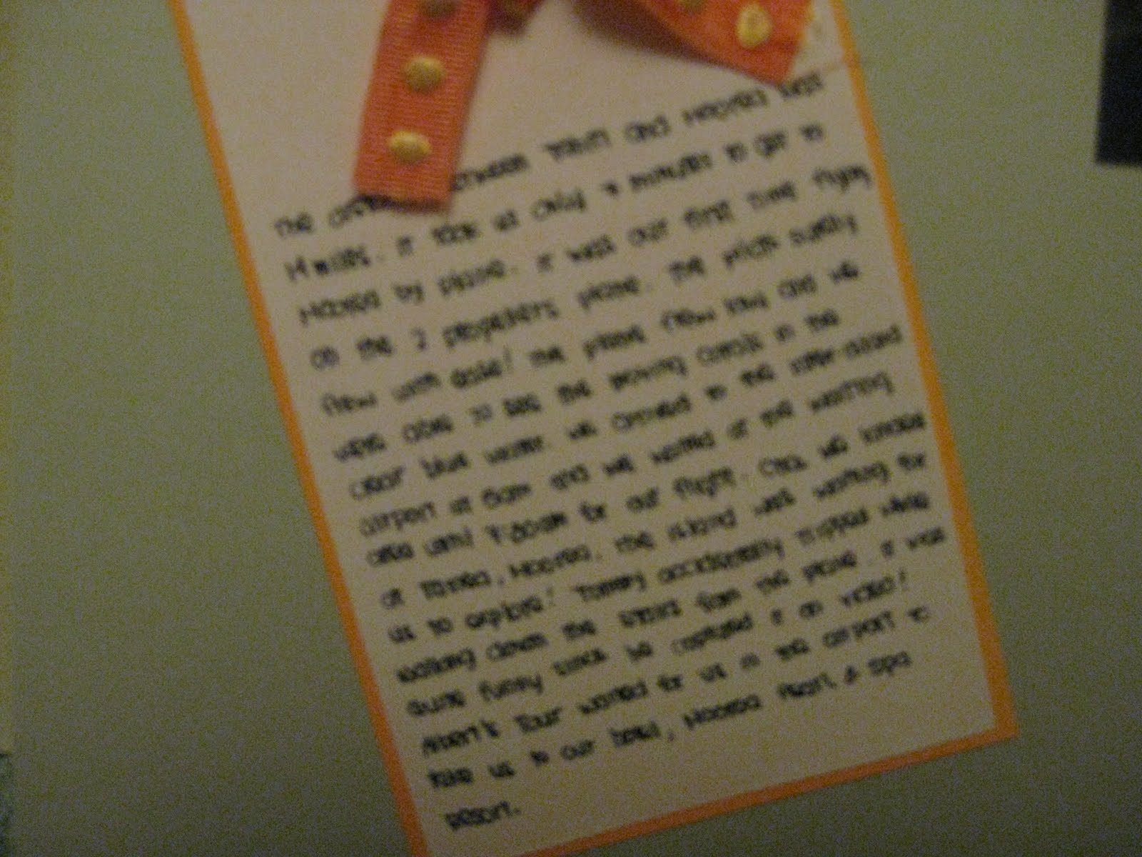
During Thanksgiving day in 2008, we spent couple hours at Descanso Gardens before Tommy went home to celebrate Thanksgiving with his family, while I spent my Thanksgiving at my aunt's house. I have to say, it gets pretty frustrating when it comes to Thanksgiving every year. I like Tommy to attend my family's Thanksgiving and every year, he refuses. I suggested to him one year that we should attend both dinners - hang out at one house for a little while and run off to the other one, he still refuses! I guess his perfect excuse which he never dare say in front of my face is, "we are not married yet, so I am not attending to your family's Thanksgiving!"

Because both of us didn't have to do any food preparation (not like any one would trust me in the kitchen with a big bird anyway), we decided to take a small outing to Descanso Gardens. I always wanted to check out this garden. It is located at La Canada Flintridge. There were a lot to see, but so little time. I wished I had more time and hope to return some day!

I decided to do a double layout for this page. The left side of the layout, I decided to put pictures of us and the right side of the layout, I put pictures of the surroundings around the garden. Again, I kept the page simple and didn't do alot of paper layering. I used one of the Fall Stacks by DCWV. There's some pattern on it if you look closely to the picture. I rounded the corners of the pictures with a corner punch. (The rounded corner punch is one of the best investments I have ever purchased for scrapbooking!)

I used my silhouette digital cutter to cut out the fonts. Instead of using plain paper, I decided to cut the fonts with a pattern paper to create some design on the letters to give a different look to the fonts.

I also used the matching pattern paper as a background for journaling. I used a tiny hole puncher to punch the white and pattern paper and added a green brad to it. I then adhered the journal to the cardstock.

For the second page, the layout on the right side, I incorporated different scenery pictures taken at the garden. I kept the page simple, and only added a strip of the same green pattern paper on the side. There were so many pictures, I didn't know how to layer papers and put pictures over it, and yet not to make the page looking busy. I also made small tags. On there, I wrote the name of the gardens or places we visited there.

I love how the green pattern paper matches the entire layout. It made the page not so boring. If I were to fix this page, I like to layer a some pattern papers to the layout. I would not use blue ink to write out the garden names. I would use black instead to make the entire page "flow."

This is the last random layout that I had done in the last year and a half. Since August 2009, I have been working on my vacation pictures to create my travel albums. My passion is travel and scrapbook. They just complement each other very well. You see the world with your eyes, capture your memories with a camera and transfer everything you remembered in a scrapbook to tell a story. That's what life is about! :)

Monday, April 4, 2011

Wine Tasting @ Santa Ynez Valley

Santa Ynez was my first wine tasting trip with Tommy. Believe it or not, after this trip, we fell in love of doing wine tasting tours and had to go to Napa Valley a month after. After we left Ojai, we drove up to Santa Ynez Valley for wine tasting. We watched the movie, "Sideways," and we picked two wineries off their list to visit.

This was a simple layout. I used only one sheet of cardstock as the background. I chose brown as the background because of the pictures in the background. Not only that, we went to visit in September, the beginning of Fall season. I wanted to use "earthy" tones for my layout.

I cut out fonts from my Silhouette cutter. Some of the fonts were smaller and they were difficult to put on the page because I didn't have the right tools to adhere them. When it comes to scrapbooking, I don't like to use glue unless it is absolutely necessary. I use runner tapes to tape everything down on the page. Not until I was 1/3 way into working on my first travel album, I decided to pick up the Xyron X to make my life easier.

For the smaller fonts, I had to pick out tiny stripes off the runner tapes and add the tapes to the font one by one by hand. I had to carefully place the tapes on each letter and had to make sure the tapes were not showing on the edges of each font.

The problem about this page was the printout of the wine map. I tri-folded the map, added a ribbon to wrap around the map, and taped the back of map to the layout. If the page doesn't have a protector cover, this would work. However, all my albums have protector covers for each sheet. I will have to cut a hole on the protector cover so I can access the map. When I have time, I will put try to figure out what to do.

As for embellishment, I decided to use rub-on to keep the page simple. The great thing about rub-ons is how simple it is to transfer designs to the project. All I need is a popsicle stick and continue to rub the design off the sheet. If done correctly, the entire design gets transferred to the project!

If I were to fix this layout, I would add frames to the pictures and round the corners with the corner punch. I would probably shrink the map to keep the entire map flat on the layout without the need to fold and write out the places we went on a tag.

Happy Monday!

Saturday, April 2, 2011

Shopping Day!

I received a $50 East West Bank Visa gift card from my company during Thanksgiving last year. I thought long and hard, trying to decide how I wanted to spend the gift card. I finally decided to spend it on scrapbook materials at Joann.

I picked up 2 stacks of DCWV paperstack - the Black Currant Stack and the Rustic Stack. I saw the Black Currant Stack while doing online shopping awhile ago and wanted to buy it. I love the pink and the black color! I decided to hold it off because I had too many papers sitting around at home (actually, I still have a lot of papers, and seem to have a lifetime supply of it, but it doesn't hurt to buy more)!

I also purchased 2 packs of page protectors. I am currently working on my cruise vacation travel album. I plan to split my vacation album into two albums - one for the 11-nights cruise, and one for the post cruise. With the initial page protectors provided with the albums, I know I will need more. I decided to pick them up today, so I don't have to worry about running to the store to buy more refills when I start putting my layouts in the album. Right now, all the pages that I put together are sitting in a pocket protector.

I decided to buy a Fiskars border punch. I have a set of 7 gypsies border punches kit at home. I love the border punches! It is easy to use and it gives a instant lift to the layout. The border punch kit is wonderful, but sometimes, I like to punch pattern more than just a line of squares or circles and want other designs.

On this shopping trip, I also picked up some new ribbons (I never have enough of them!), a pen for journaling, and a stack of white cards and envelopes. Besides scrapbooking, I have also been making cards. I usually make birthday cards for my co-workers. The cards are not the best, but I hope to do better as I create more in the future.

Hope you are all enjoying your weekend! :)